R940-R941 – Château Noir, 1903-1904 (FWN360–FWN361)
Pavel Machotka
(Cliquer sur l’image pour l’agrandir)
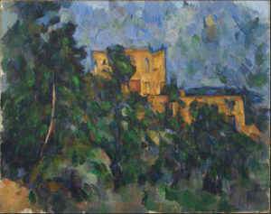
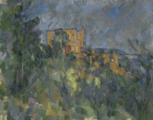
In the Montigny picture (R832-FWN327) Cézanne contended with the question of translating a tall, three-dimensional array into the two dimensions of the canvas, and chose his answer in what might be called the Northern Sung manner. In his paintings of the Château Noir building, however, the ones where it is seen from the side, the question does not arise. A profile view (R940, R941,FWN360–FWN361) is already shallow and firmly located in the picture plane. It allows Cézanne to work with a simple contrast: that of a rigid, orange-yellow object against an inviting, dense, disorderly, three-dimensional expanse of dark greens. The representational task is simpler, but the opportunities for underscoring color distinctions and surface rhythms are greater. The west wall of the building, when it reflects the late afternoon sun, may be incandescent against the dark trees, and set in the center of the canvas, it can stand as a pivot between the blues and the greens. The three hues make up the color triad that Cézanne uses so simply and compellingly in his Provence landscapes.
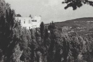
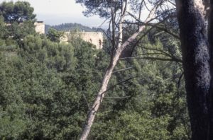
The Château Noir pictures represent the very same motif and were painted either from a somewhat different height or possibly some time apart (in R940-FWN360, the sapling on the right is a bit taller). So rapid has been the growth of pines and other trees into the former olive grove at the foot of the building that even in 1935 Rewald’s photographs had to be taken to the right of where Cézanne had stood and mine from another spot altogether. His photograph shows the building in relation to its setting while mine shows the colors as they appear in the late afternoon sun.
R940-FWN360, the New York painting, is the one with the compelling appeal of color but the other picture (R941-FWN361) is by no means duller or inferior; it simply represents the more complex color harmony and the flatter light of an overcast day. Admittedly, the New York painting is easier to discuss: its colors are saturated, the blue-yellow complementary is particularly rich, the greens are in places incandescent. A lumpy, rhythmical texture animates the surface, even where we least expect it (as in the sky); the painting is strongly tactile, musical in its implication, deeply, almost relentlessly, integrated. I sense in it a wholeness that transcends the appeal of the site – a balance created by the painter with carefully placed patches that refer to nothing at all but have a distinct pictorial purpose, such as the bit of yellow in the upper right corner which resonates with the patch of ground in the lower left corner and sets up a visual diagonal opposed to the massive one of the sliding hill.
The Musée Picasso version (R941-FWN361) is calmer, stabler, less tactile; the source of its light is diffuse, the sky is flecked with greys and violets, and the patches representing the trees in the bottom half lie next to each other, in the same plane. There is one explanation that accounts for all these changes: the day that served as the impetus for the picture was overcast. With the light darker and evenly distributed, shadows disappeared and the trees looked flatter – and Cézanne reflected the change right away in his touch. The patches were no longer called upon to denote the volumes of the trees, merely an extended span of foliage; their colors were duller, more subtle. The grey-blues tend toward the violet and there are even a few grey-pink patches; this cool emphasis allows the greens to remain warmer. Surely this harmony is no less well balanced than the other, more brilliant one; if it were a piece of music, one would imagine hearing it played on a harpsichord rather than a concert grand – and one would find that there has been no loss in polyphony.
It is clear, then, that the late patches are a flexible device that does different things at different times; it may represent objects, as here the trees, or it may create order, rhythm, and color balance, as in the sky. And it may well do both at the same time, subtly enough to evade our awareness. In the New York picture, there are lumps of green in the sky, which, knowing Cézanne’s late work, we have come to expect to be there to bring the various colors closer together, but as we follow them to the right, we notice that they darken and become attached to branches — that they in fact represent the leaves of the sapling. The transition is inconspicuous, and it is its delicacy that repays the hard looking that these canvases invite.
Source: Pavel Machotka: Cézanne: Landscape into Art


